THE REAL WINE CO.
Brand Strategy & Identity System
Repositioning a long-standing independent wine retailer through strategy and a modern, scalable visual identity.
OVERVIEW
The Real Wine Co is an independent wine retailer specialising in wines from small, carefully selected producers. Despite strong foundations, the brand had grown organically over 17 years without a formal visual identity or clear positioning.
The project focused on repositioning the brand within the contemporary wine landscape and developing a cohesive visual system designed to scale across digital, marketing and e-commerce touchpoints.
Role & Impact
Independent Senior Brand Designer leading strategy and visual identity development.
Led brand discovery, stakeholder interviews and competitive research to define positioning
Developed and presented multiple creative directions, guiding final concept selection
Designed a complete visual identity system and brand guidelines
Built scalable campaign frameworks across social, email and digital channels
Delivered campaign and seasonal assets across digital and print
Collaborated with developers to translate the identity into a functional e-commerce experience
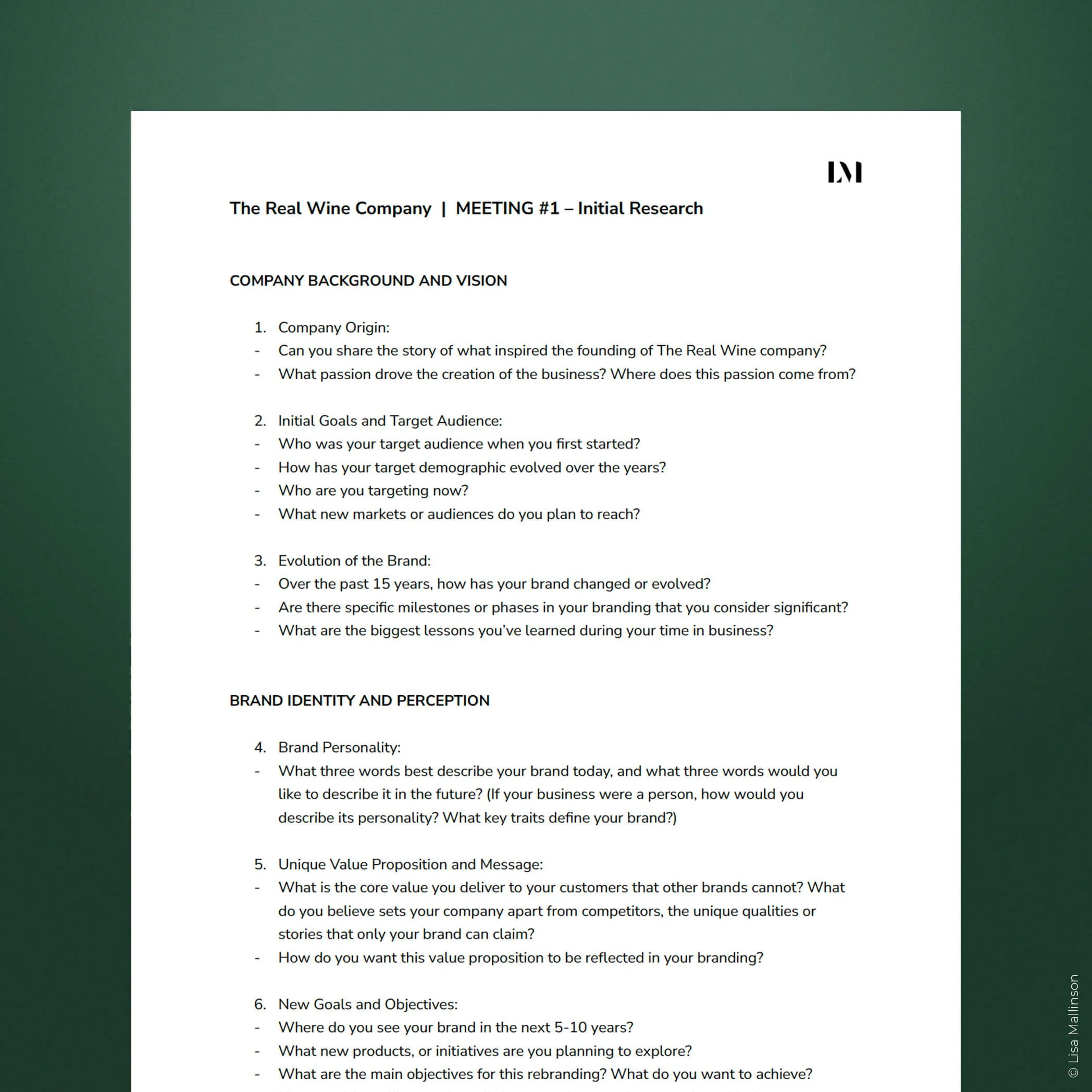
1. DISCOVERY
To define the right direction, I began with a brand discovery phase, conducting a structured interview with the founders to understand:
the origins of the business
their long-term ambitions
how customers currently perceived the brand
and where they wanted the brand to evolve.
These conversations helped uncover the core strength of the business — a curated selection of wines from small independent producers — and clarified the tone the brand should communicate moving forward.
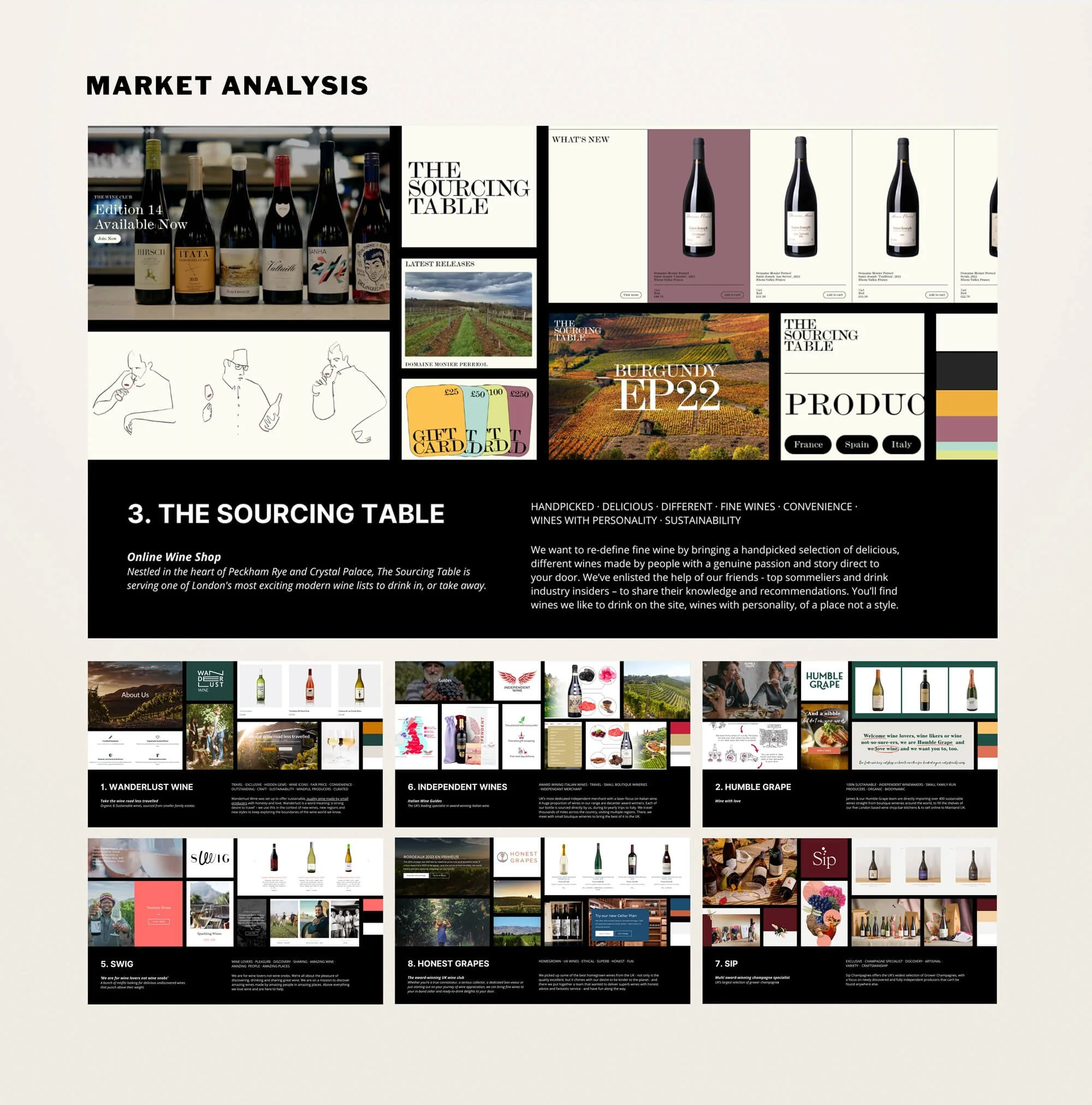
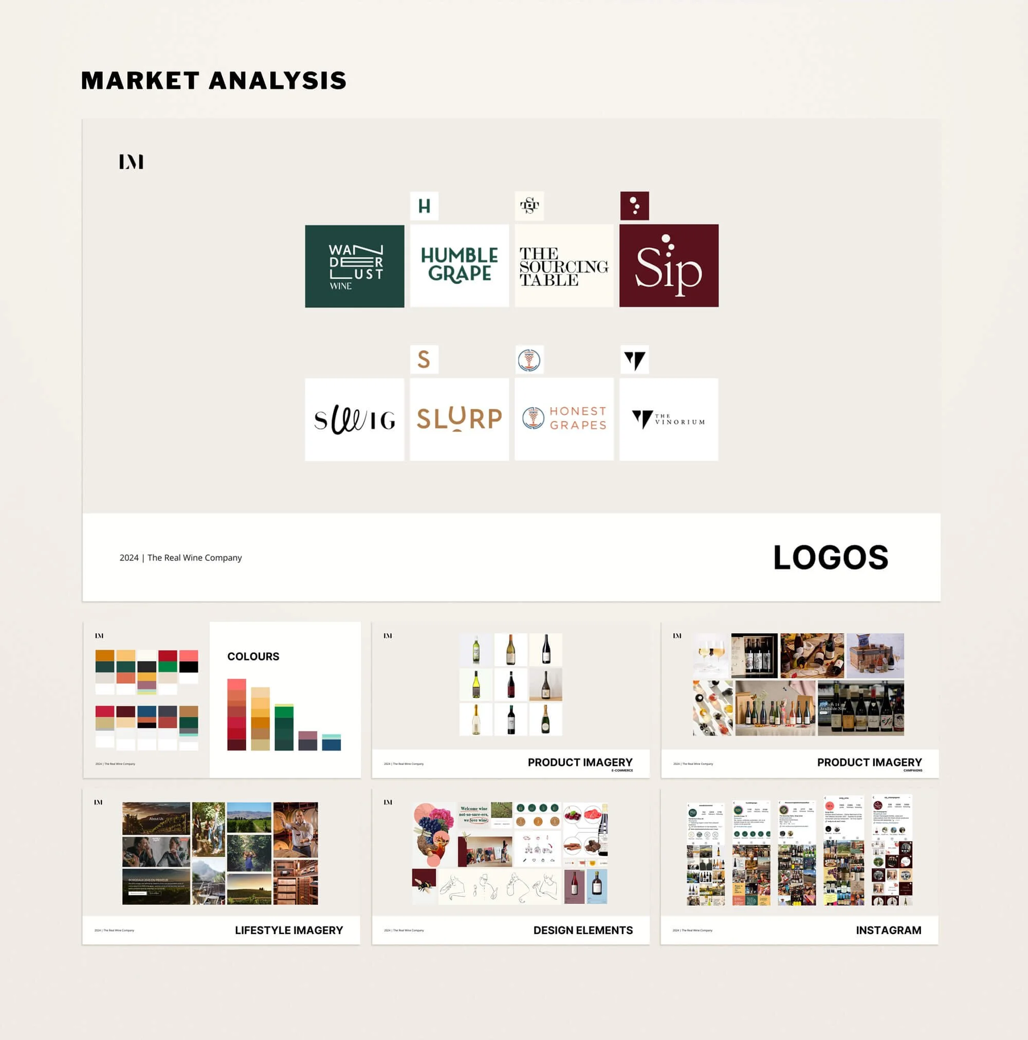
2. MARKET ANALYSIS
To ground the design direction in the contemporary wine landscape, I conducted a visual benchmark across independent wine retailers operating in a similar space.
The analysis explored how these brands communicate through typography, colour, photography and e-commerce design, identifying common patterns as well as opportunities for differentiation.
This research informed the strategic direction of the identity and helped ensure the brand would feel contemporary while remaining distinctive within its category.
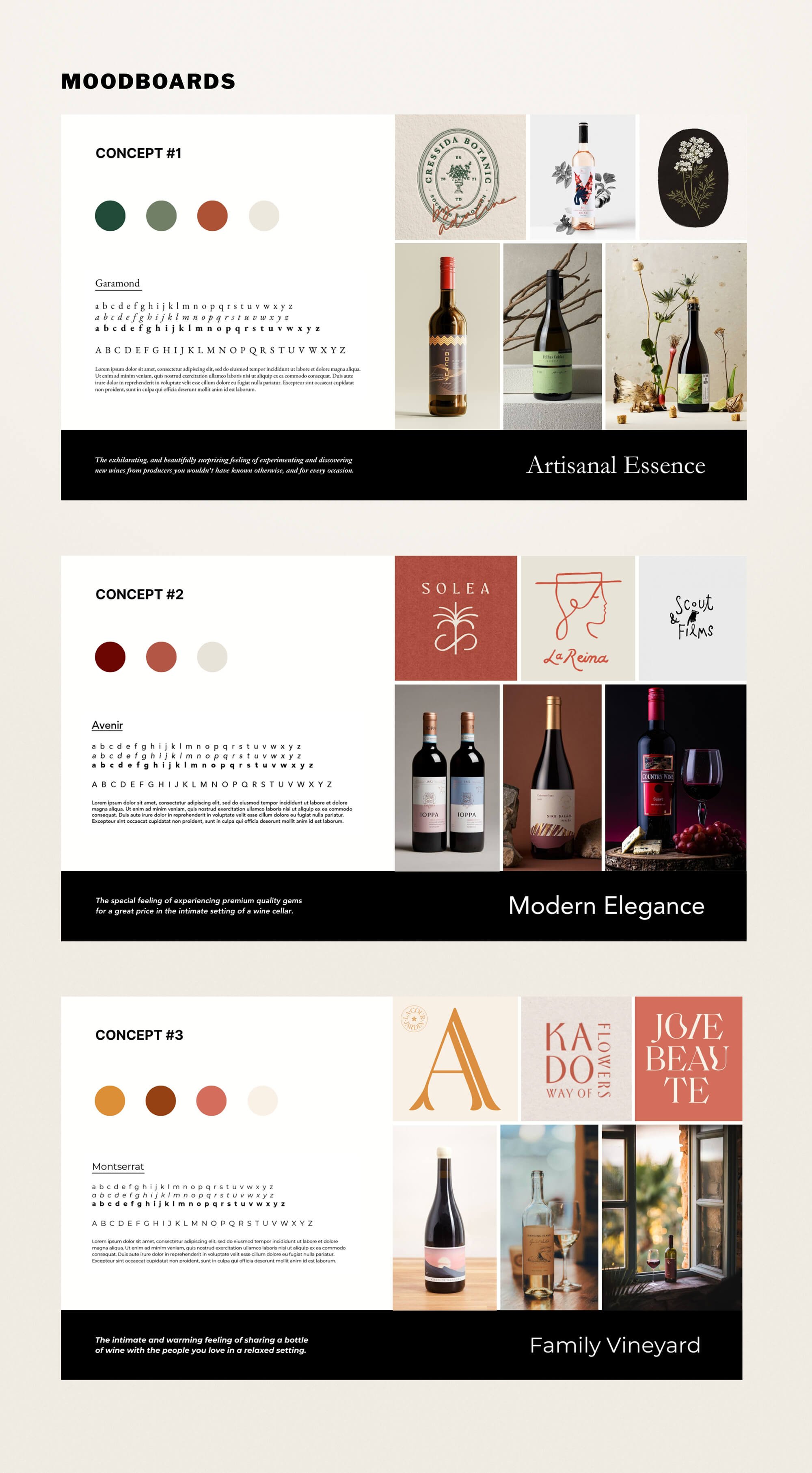
3. STRATEGIC DESIGN EXPLORATION
Based on the discovery and market analysis, I developed three distinct creative territories exploring different ways the brand could evolve — from artisanal discovery to refined cellar elegance and a more intimate family-led approach. Each direction explored typography, colour, imagery and logo design to help the founders visualise the potential positioning of the brand.
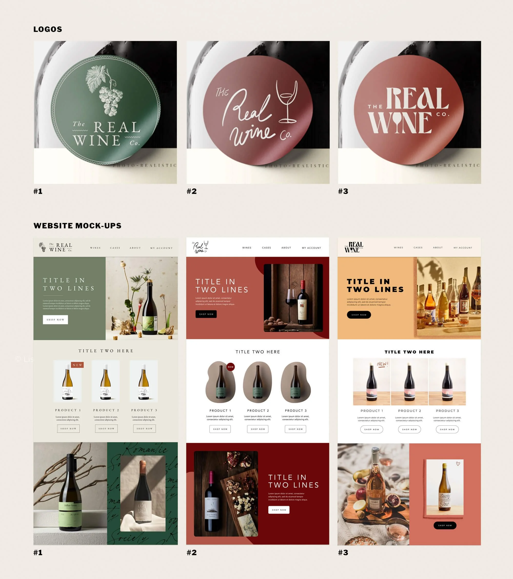
4. BRAND IDENTITY
Following the concept exploration phase, the selected direction was developed into a complete visual identity designed to reposition The Real Wine Company as a modern independent wine retailer.
The previous identity relied on bright colours and illustrative elements that no longer reflected the maturity of the business or the quality of its curated wines. The new identity introduces a confident typographic logo and a more restrained visual language, allowing the brand to feel contemporary while remaining warm and approachable.
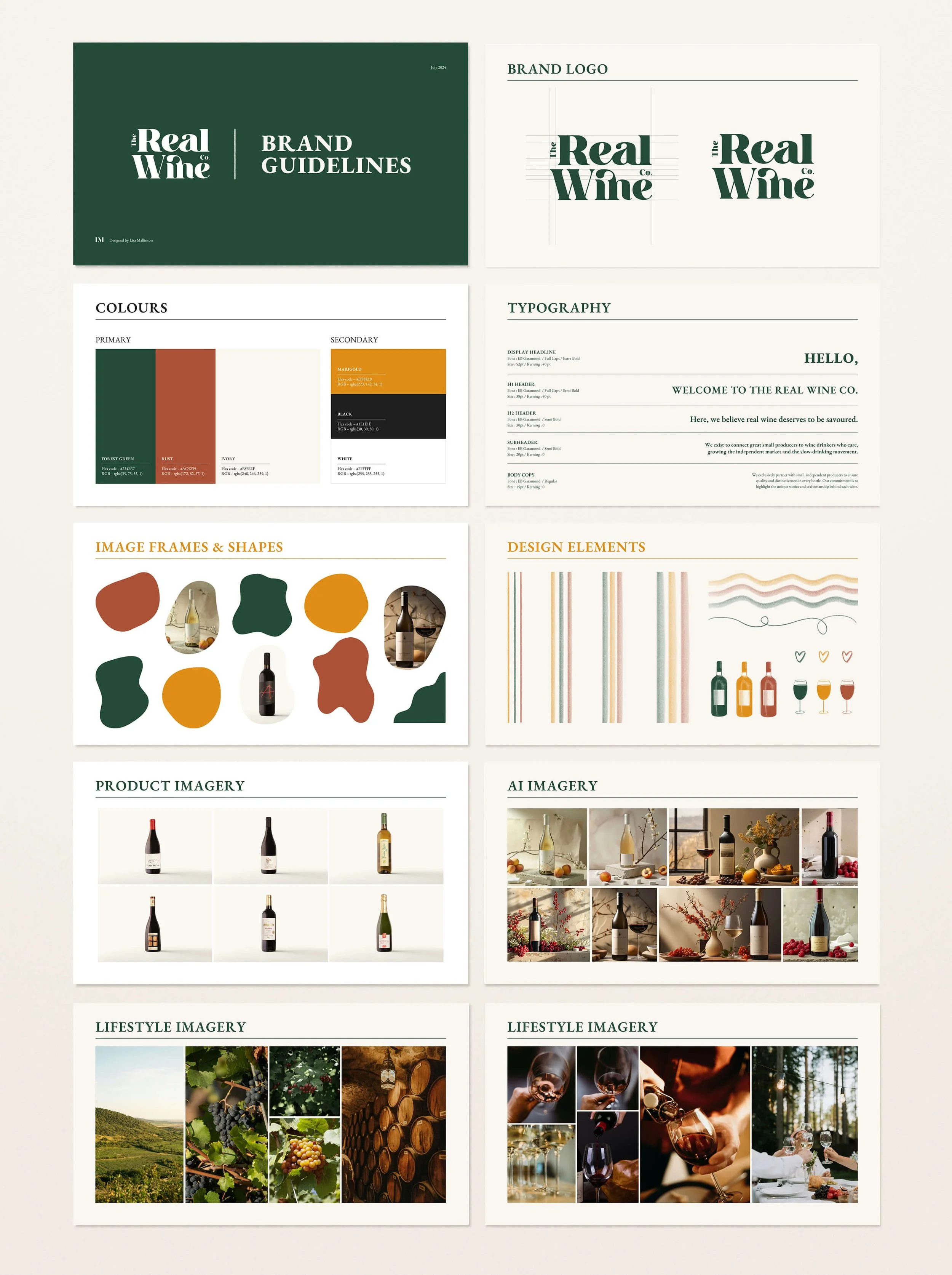
The system combines a refined serif typeface with a natural, earthy colour palette inspired by vineyard landscapes and wine tones. Expressive graphic elements and organic shapes introduce character and movement, while a structured typographic hierarchy ensures clarity across digital and marketing communications.
Together, these elements form a cohesive brand system designed to support the company’s growth while maintaining the authenticity and independence at the heart of the business.
4. BRAND APPLICATIONs & MARKETING SYSTEMS
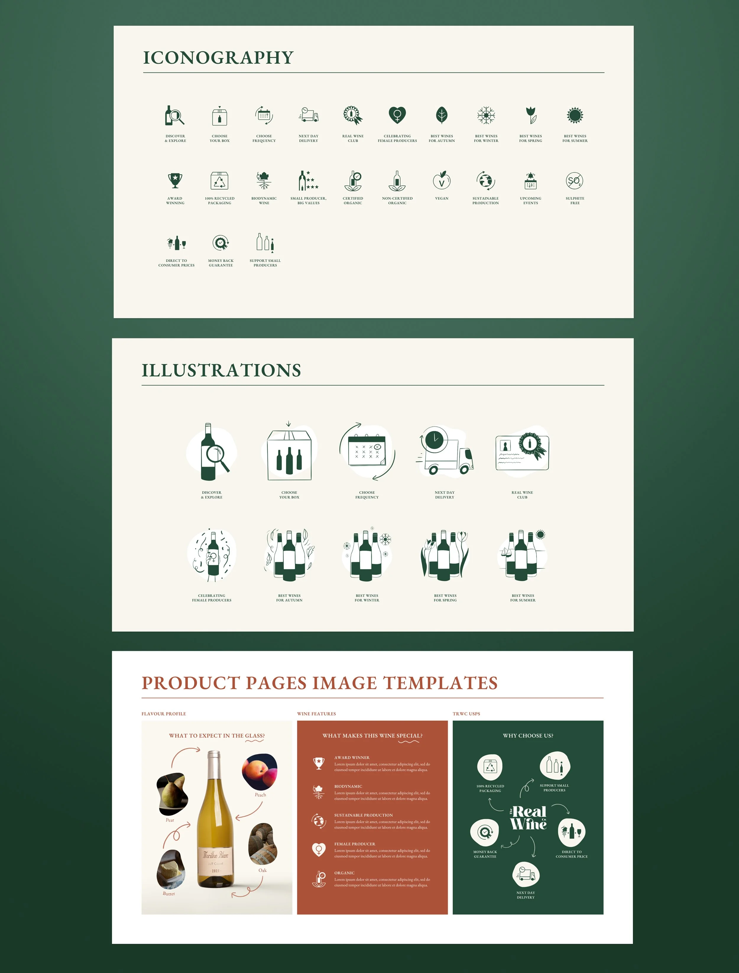
To ensure the identity could be used consistently by a small internal team, the brand was translated into a structured set of marketing and digital templates designed to support day-to-day communication.
A series of flexible frameworks were developed for social media, email and website promotions, enabling the team to create content while maintaining a coherent visual language. These included thirty-nine evergreen social media templates, four modular email layouts, and a suite of promotional formats for both the website and marketing channels.

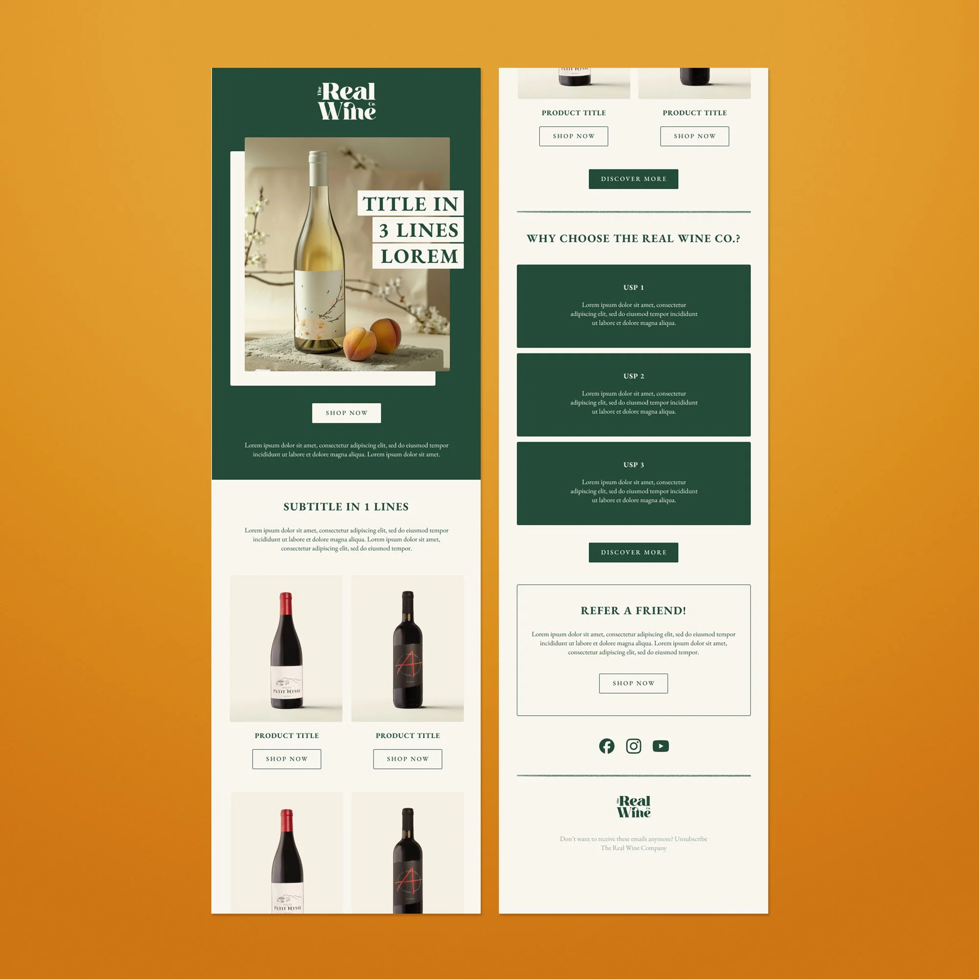
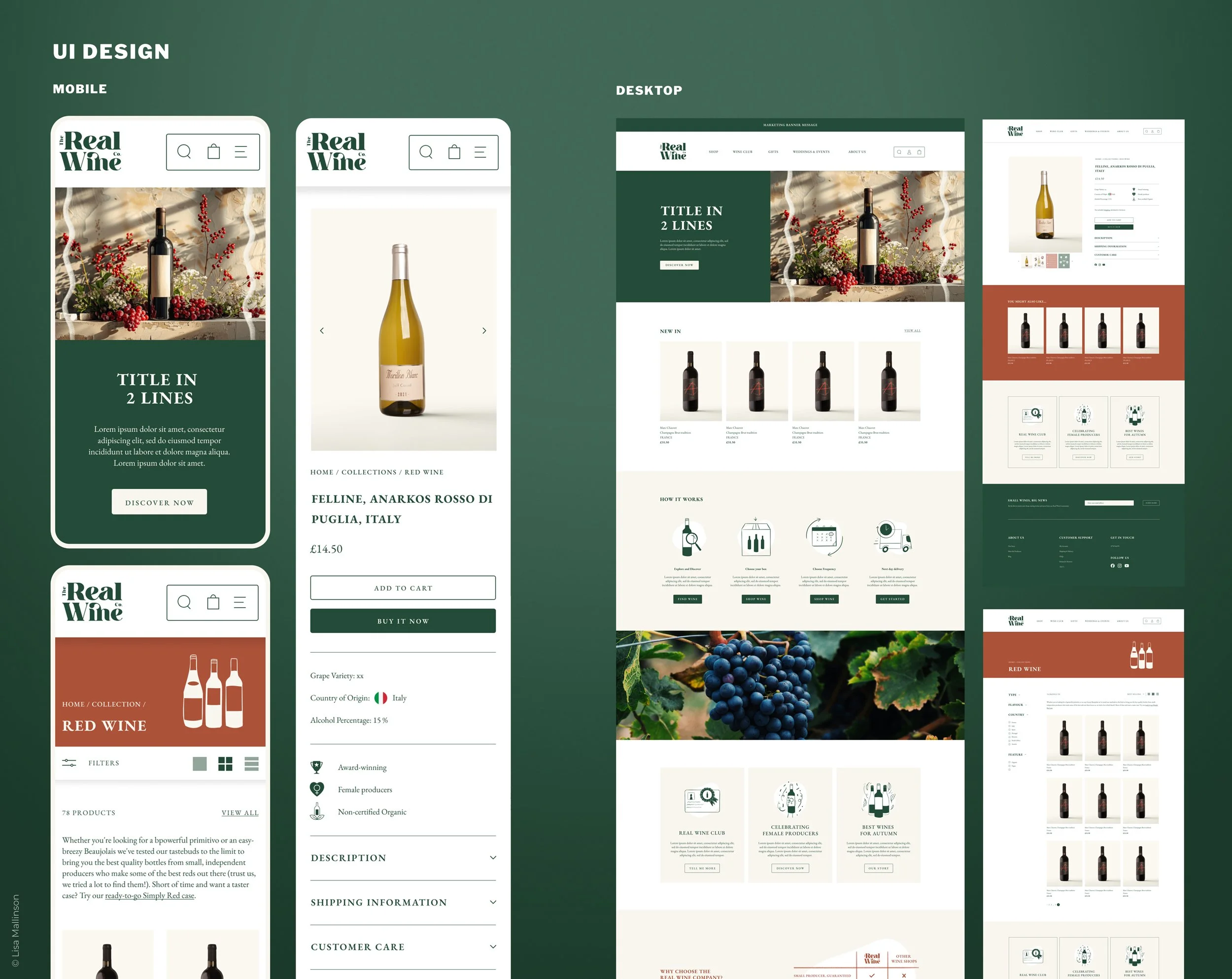
Alongside these marketing systems, I developed the UI direction for the company’s new website, collaborating closely with developers to translate the design mock-ups into a functional CMS environment. Layouts and components were refined throughout the build process to ensure the final implementation remained aligned with the brand system while accommodating technical constraints.
Together, these elements transformed the identity from a static design into a practical toolkit, allowing the brand to communicate consistently across digital and physical touchpoints while giving the internal team the flexibility to manage content independently.