POPSA
Brand Evolution & CRM Creative Strategy
Evolving the visual language and marketing system across retention (CRM) and multi-channel campaigns for a fast-growing AI-powered consumer product.
OVERVIEW
Popsa is a consumer tech company building AI-powered tools to automate the creation of personalised photo products, recognised multiple times as one of the UK’s fastest-growing tech startups.
As Design Lead, I led the evolution of the brand’s visual language across retention (CRM) and multi-channel campaigns, introducing scalable systems and expanding how the product was communicated beyond purely functional messaging.
Role & Impact
Design Lead for retention (CRM), with broader ownership of promotional marketing across channels at a fast-growing AI-powered consumer product.
Led and developed a team of designers, setting creative direction across CRM and multi-channel promotional campaigns
Established a new storytelling approach to better express the product’s emotional value alongside its functionality
Built and scaled campaign systems to support high-volume, multi-channel output
Elevated the brand’s visual quality through more refined art direction and improved consistency across touchpoints
Partnered with marketing, product and leadership to shape creative strategy and output
1. CRM Creative Strategy
Visual repositioning
As the target audience evolved, the visual language required greater refinement and emotional depth.
I led the repositioning of the CRM visual direction, defining and embedding a more elevated aesthetic aligned with the evolving target audience. Following initial exploratory collaboration, I continued to develop, refine and scale the direction across campaigns, securing executive alignment and long-term adoption.
The updated visual language was aligned at executive level and became the foundation for subsequent creative output.
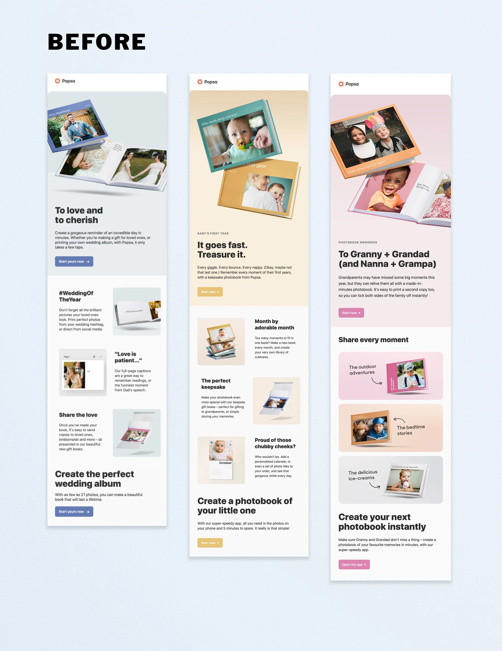
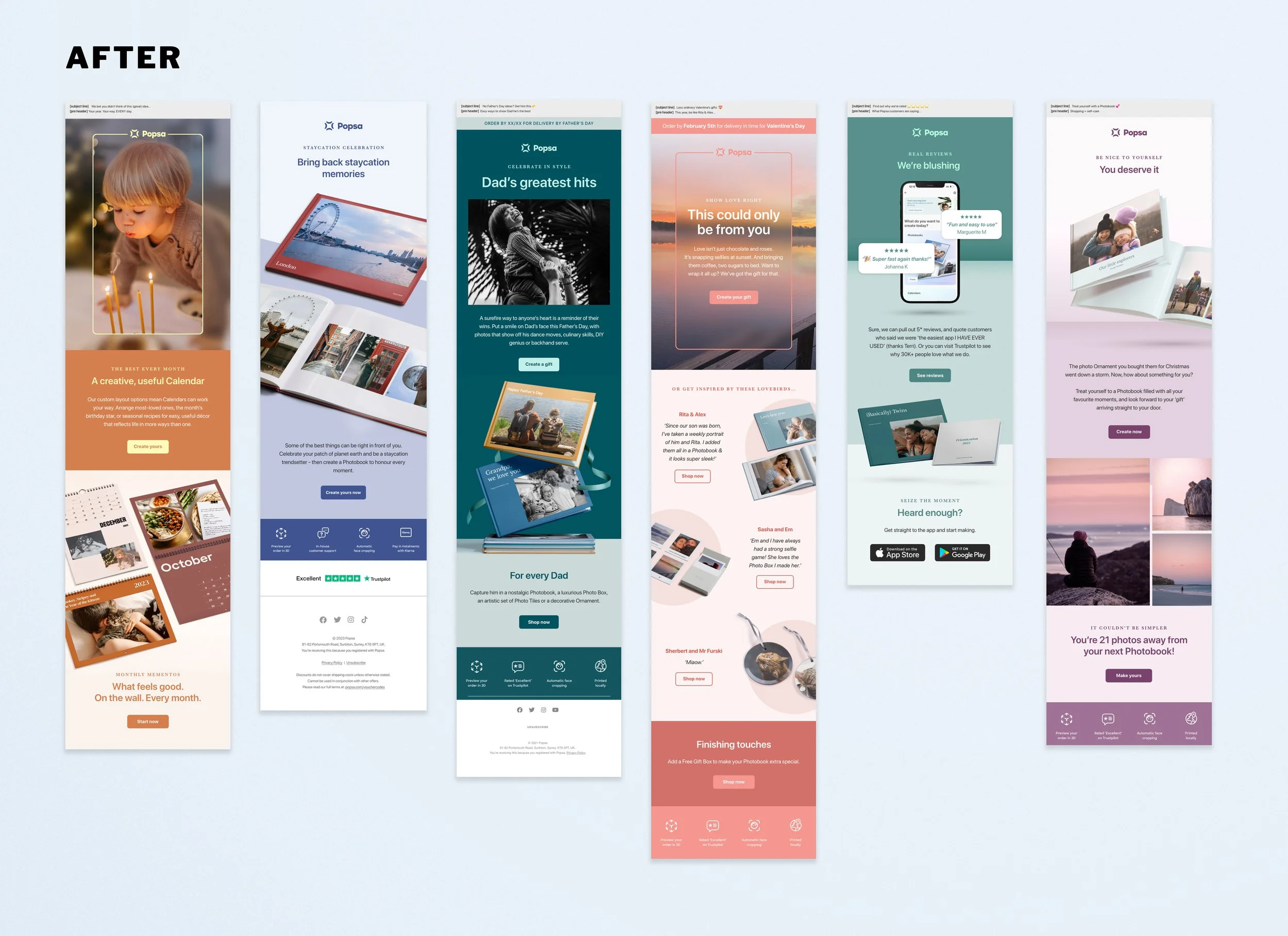
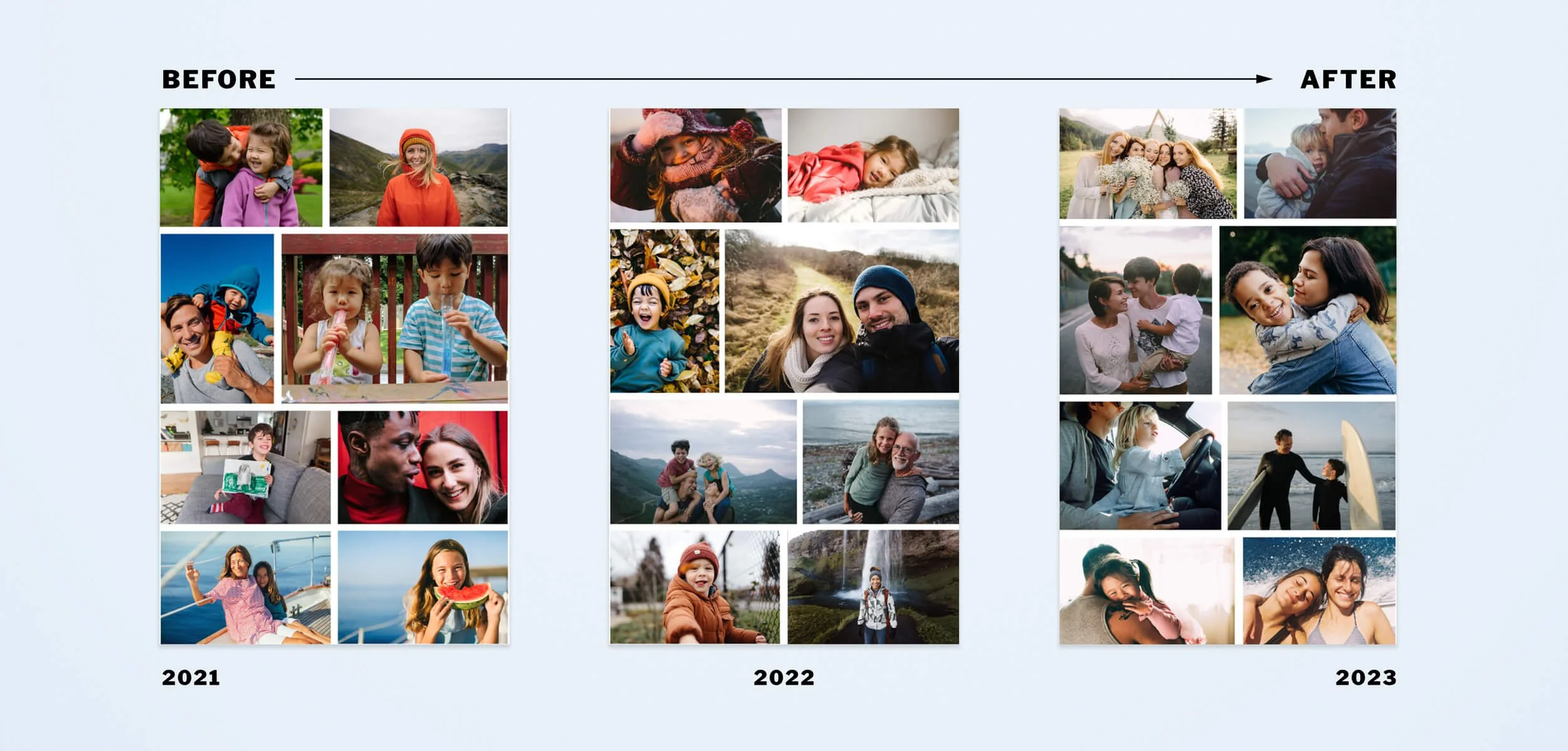
From Functional Communication to Emotional Storytelling
Early CRM campaigns were largely product-led and feature-focused — structured around functionality, benefits and promotional messaging.
As the brand evolved, so did the role of CRM. Rather than acting solely as a conversion channel, it became an opportunity to reinforce the emotional value of the product.
Creative shifted from multi-module, utility-driven layouts toward more focused, narrative-led campaigns. Emails began with memory, occasion and feeling — positioning the product as a meaningful keepsake rather than simply a photobook.
This reframed CRM as a brand-building touchpoint, not just a promotional one.
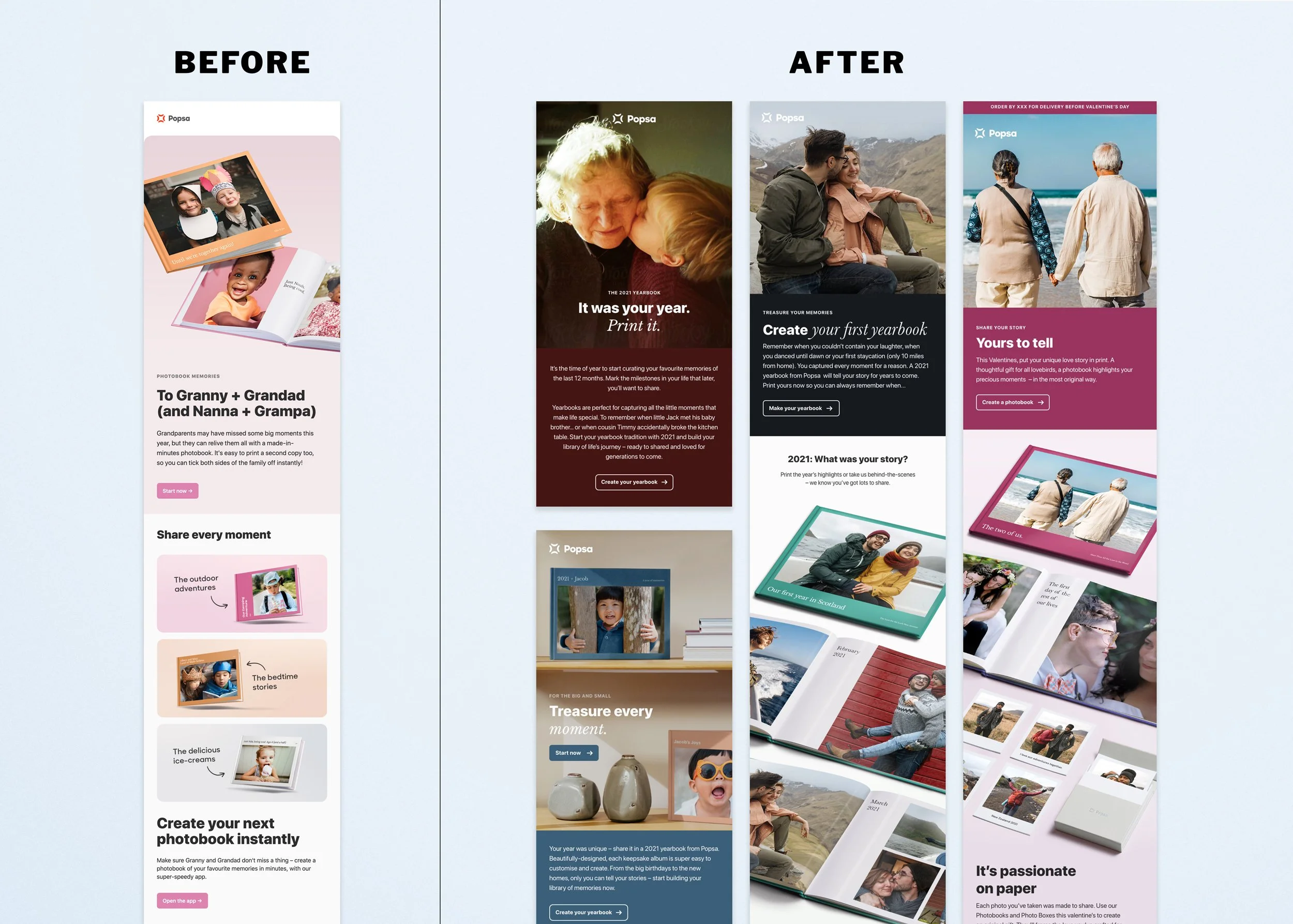
2. Redefining Popsa’s photography direction
As a photo product brand, CRM relied heavily on stock imagery to represent moments and memories.
In collaboration with the Creative Lead, I helped define a more elevated photographic vision for the brand — moving away from generic, staged imagery towards candid, memory-led storytelling. I then led the research, sourcing and long-term implementation of this direction across CRM, embedding clear selection principles and refining the approach over time to ensure consistency and emotional depth.
3. Elevating campaign design
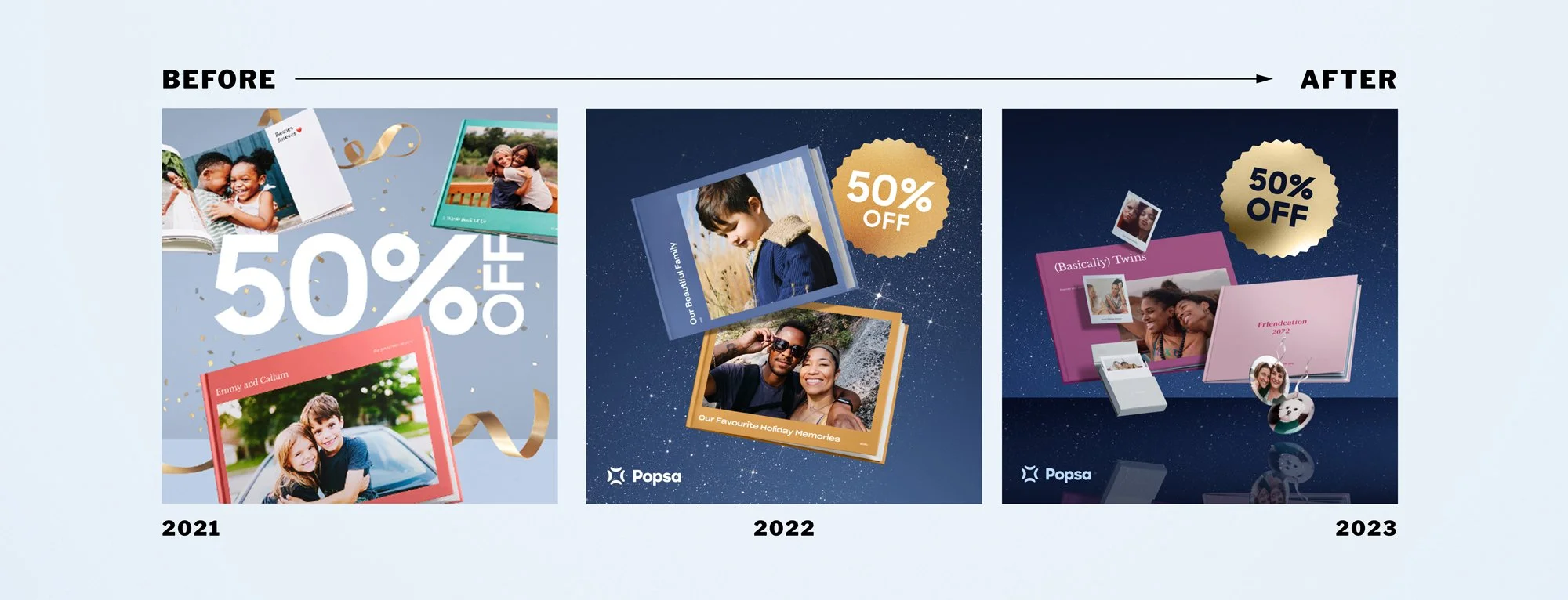
Black Friday: Raising the Standard Within a Fixed Structure
The core campaign architecture remained fixed across annual cycles. Within those parameters, I progressively elevated the craft — refining realism, depth, lighting and compositional balance to move the aesthetic from overtly retail toward a more sophisticated, premium expression.
4. Creative strategy OKR — expanding product storytelling
CONTEXT
Alongside evolving Popsa’s visual direction, I led a creative OKR focused on improving the effectiveness of marketing communications and expanding how the product could be visually communicated.
At the time, most marketing communications focused primarily on the ease of use of the app — highlighting how quickly a photobook could be created. While this remained a central value proposition, there was an opportunity to broaden the narrative around the product experience.
CROSS-TEAM RESEARCH
To better understand how the product was perceived and communicated across the organisation, I initiated a series of cross-team interviews with stakeholders across: Product, digital & printed product design and customer support.
These conversations helped uncover gaps in how key aspects of the product were represented in our communications — including the creative possibilities of the app and the quality of the printed photobooks.
Key insight
While the app is used briefly during the creation process, the printed photobook often remains in customers’ homes for years as a lasting keepsake.
However, this long-term value of the physical product — as well as the creative freedom offered by the app’s customisation tools — was rarely highlighted in marketing communications.
Creative opportunity
Based on these insights, I developed a creative roadmap to expand the visual narratives used in Popsa’s marketing.
These included themes centred around:
• creative expression within the app
• the quality and finish of the printed product
• the emotional value of preserving memories
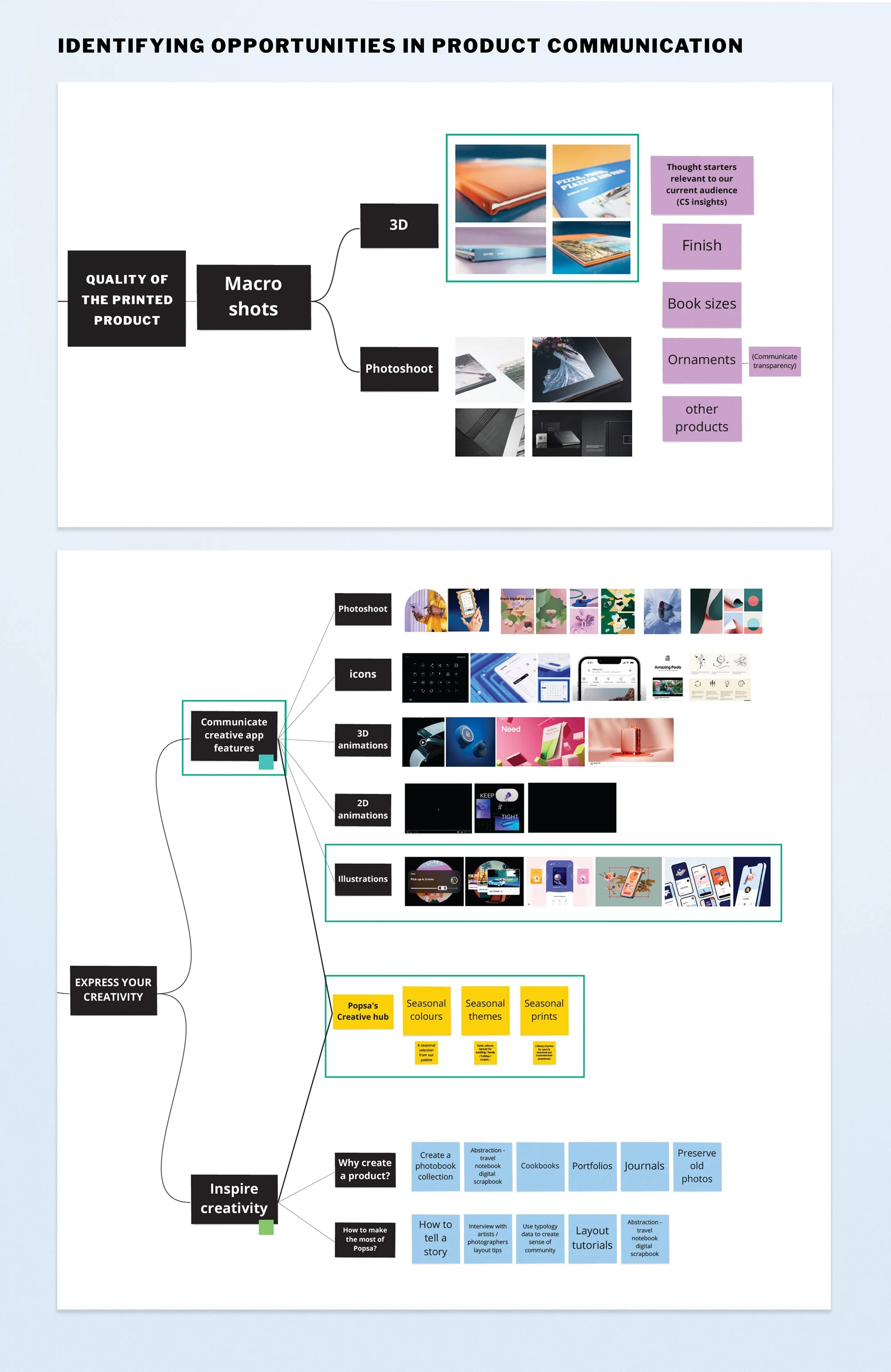
Outcome
This framework informed the creation of new visual assets and communication formats that could scale across multiple marketing channels.
It also created opportunities for designers across the CRM and acquisition teams to explore new creative approaches — including motion, illustration and 3D — expanding Popsa’s visual language while showcasing the team’s work across the organisation.
The work below highlights a selection of campaigns and assets developed by the team as part of these initiatives.
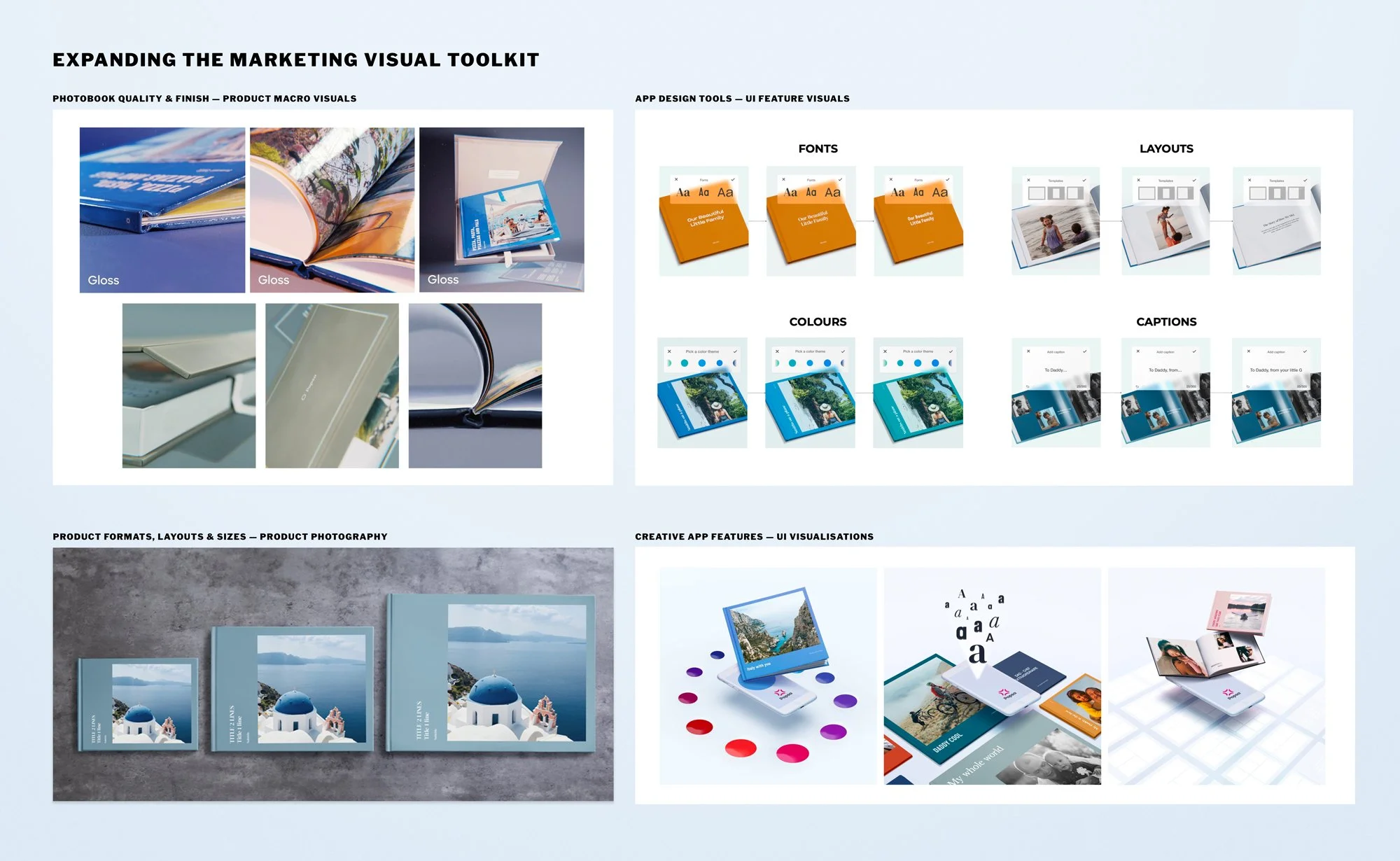
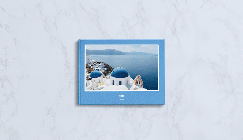
Product Photography Art Direction
These initiatives expanded Popsa’s marketing visual toolkit, introducing new formats and creative approaches across CRM, social and acquisition campaigns.
As part of this new visual toolkit, I art directed a product photography shoot designed to highlight the quality and finish of the printed photobooks, working with a photographer and freelance art direction support.
I also handled retouching and asset production, building a reusable library of imagery and editable mock-ups showcasing different book sizes and layouts for use across lifecycle emails, social media and acquisition campaigns.