MY ROLE
Design Consultant
Brand Strategy · Brand Identity · Marketing Systems · UI Design · Developer Collaboration · Team Training
The Challenge
A long-standing brand built on genuine relationships with small producers — handpicked wines, no middlemen, a loyal following grown almost entirely by word of mouth. The identity hadn't kept pace. Inconsistent across touchpoints and no longer reflecting the quality of what was being sold, it was losing customers before they'd even looked at the wine.
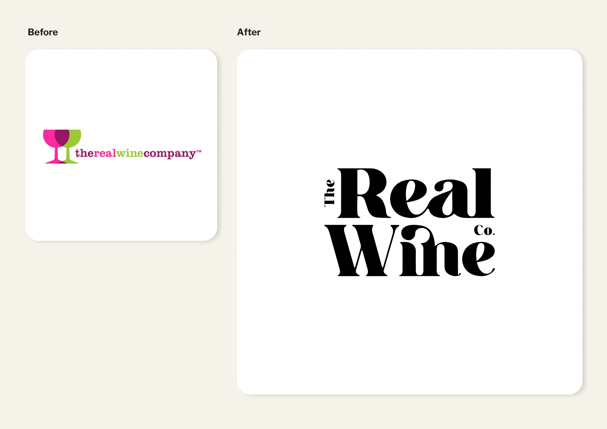
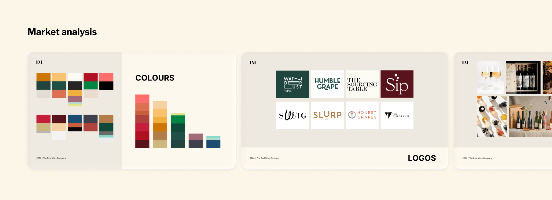
Competitor research across ten independent wine brands revealed a clear opportunity — most were either leading on discount or leaning into tired traditional wine codes. The new identity had room to be something neither: contemporary and characterful, warm without being folksy, premium without the snobbery.
A typography-led identity designed to feel warm, confident and contemporary — without tipping into premium-for-premium's-sake. Flexible enough for a packaging stamp, a Klaviyo email, and a bottle sticker.
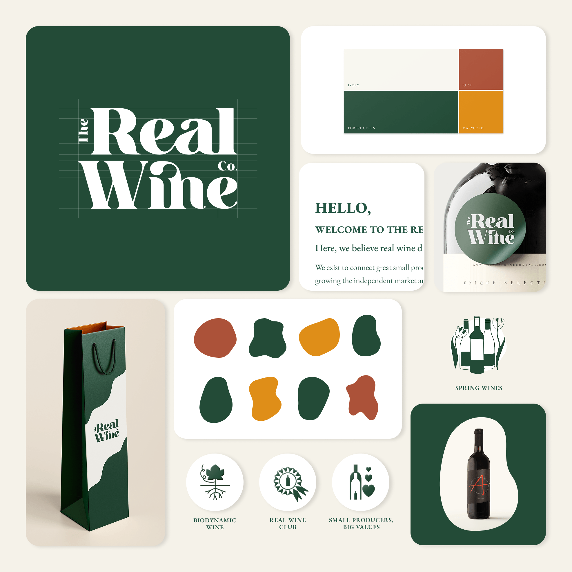
A modular toolkit including 80+ social templates, 4 Klaviyo email layouts and campaign frameworks. Handover tutorials ensured the team could update templates and produce new assets independently from day one.
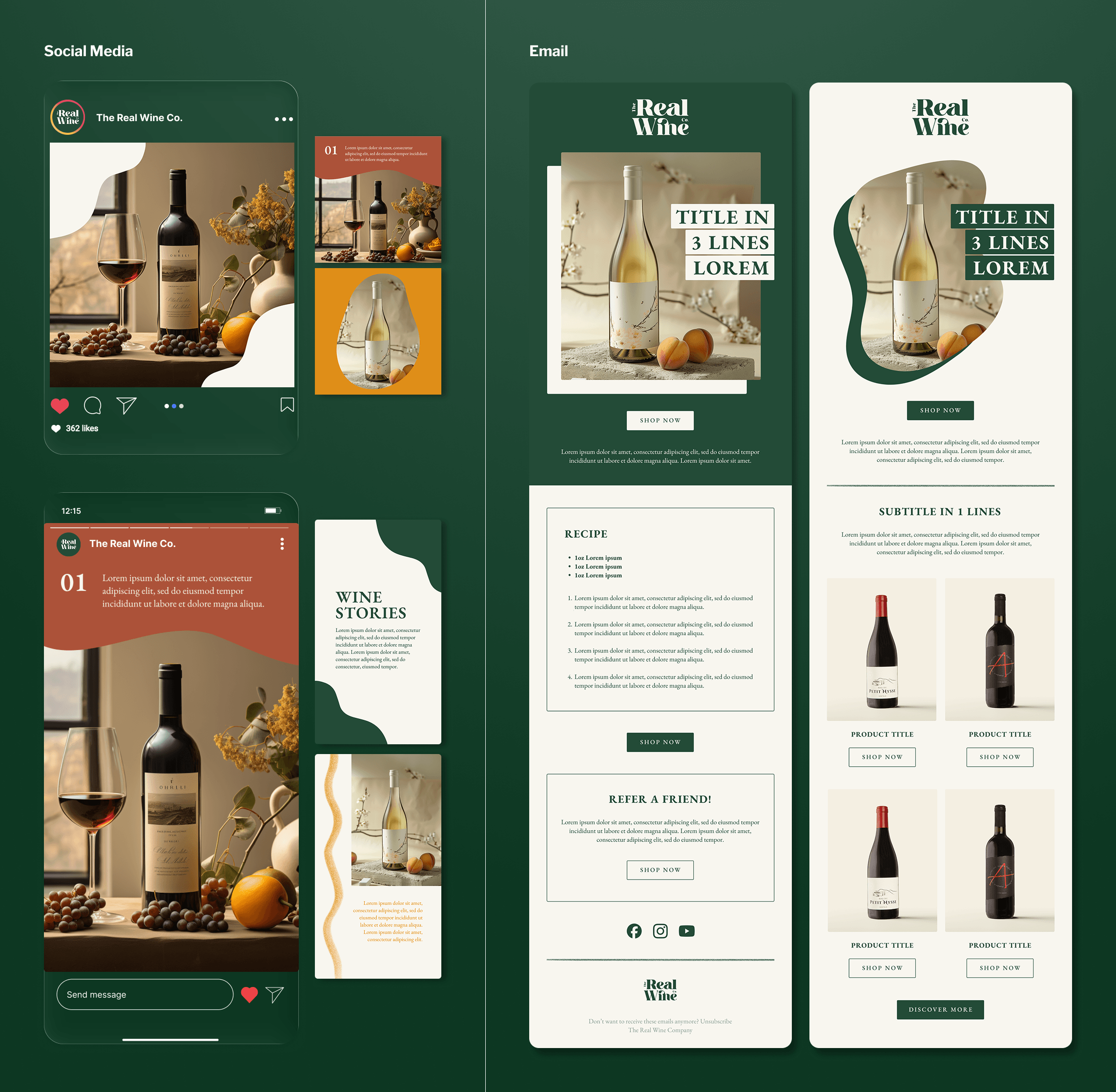
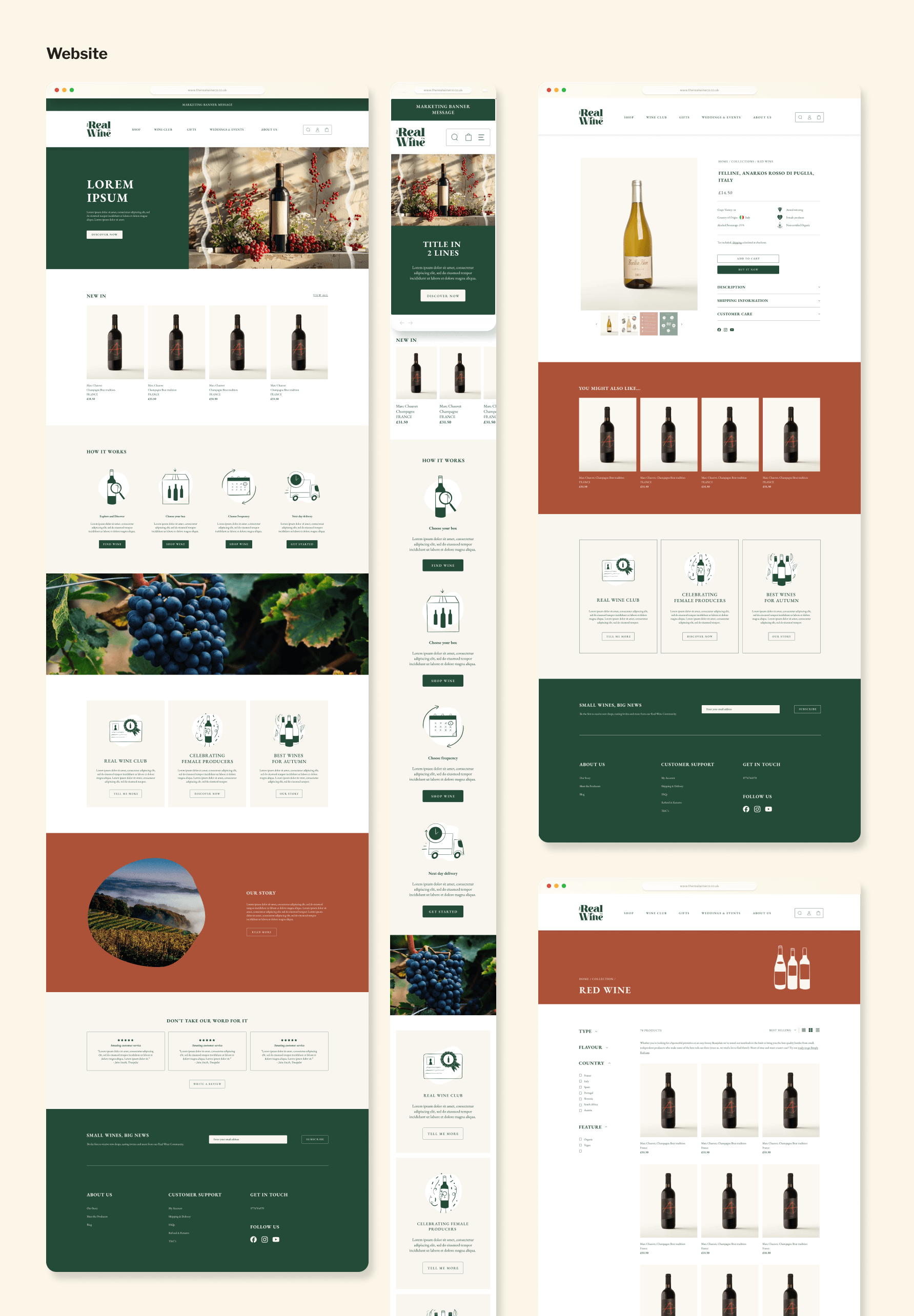
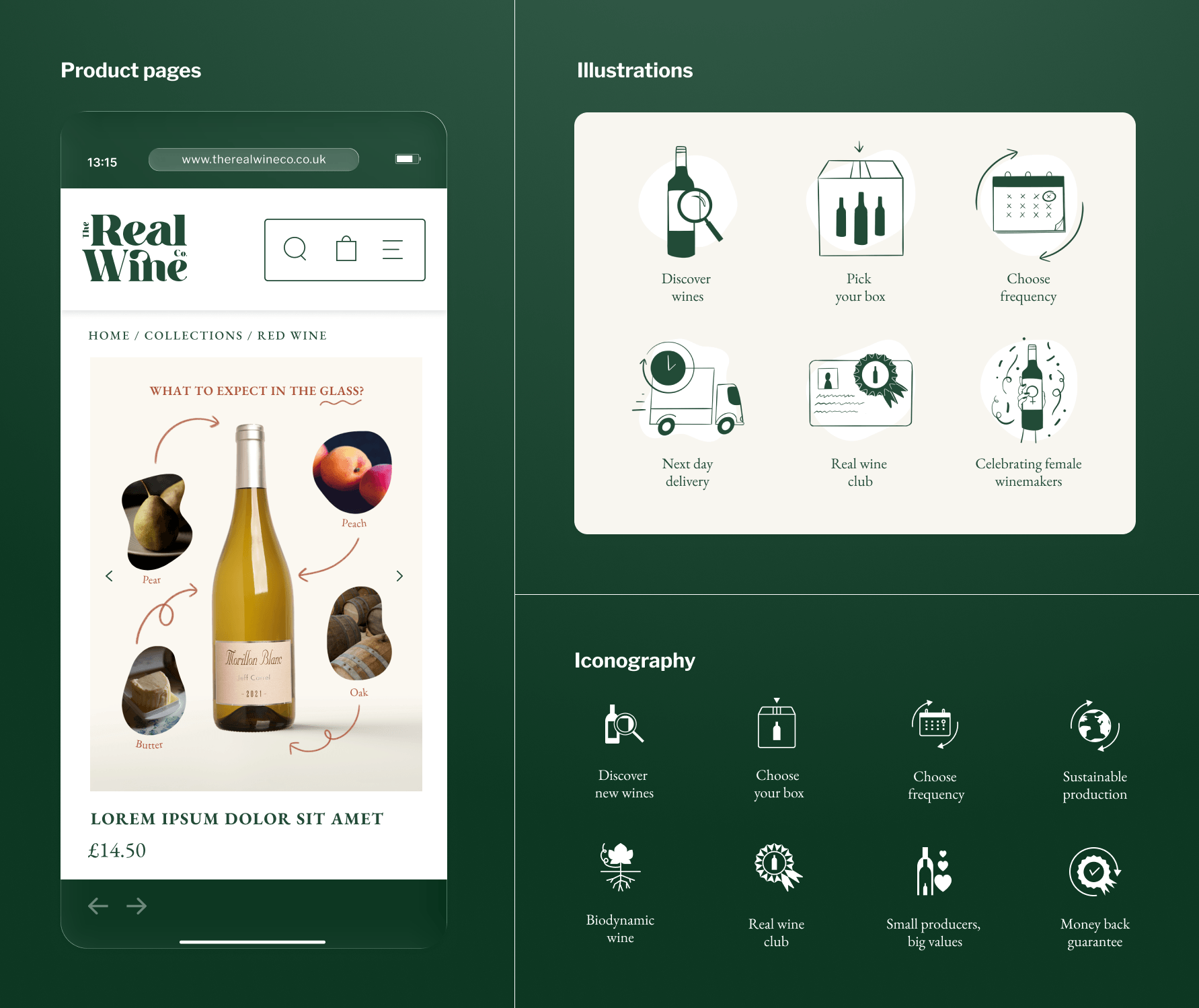
Designed and customised a Shopify template to fully reflect the new brand identity, including a suite of reusable image templates for self-serve use. Collaborated closely with the development agency to ensure the final build matched the design intent across desktop and mobile.
A bespoke illustration and iconography style designed to reinforce the brand personality and support navigation across digital touchpoints.
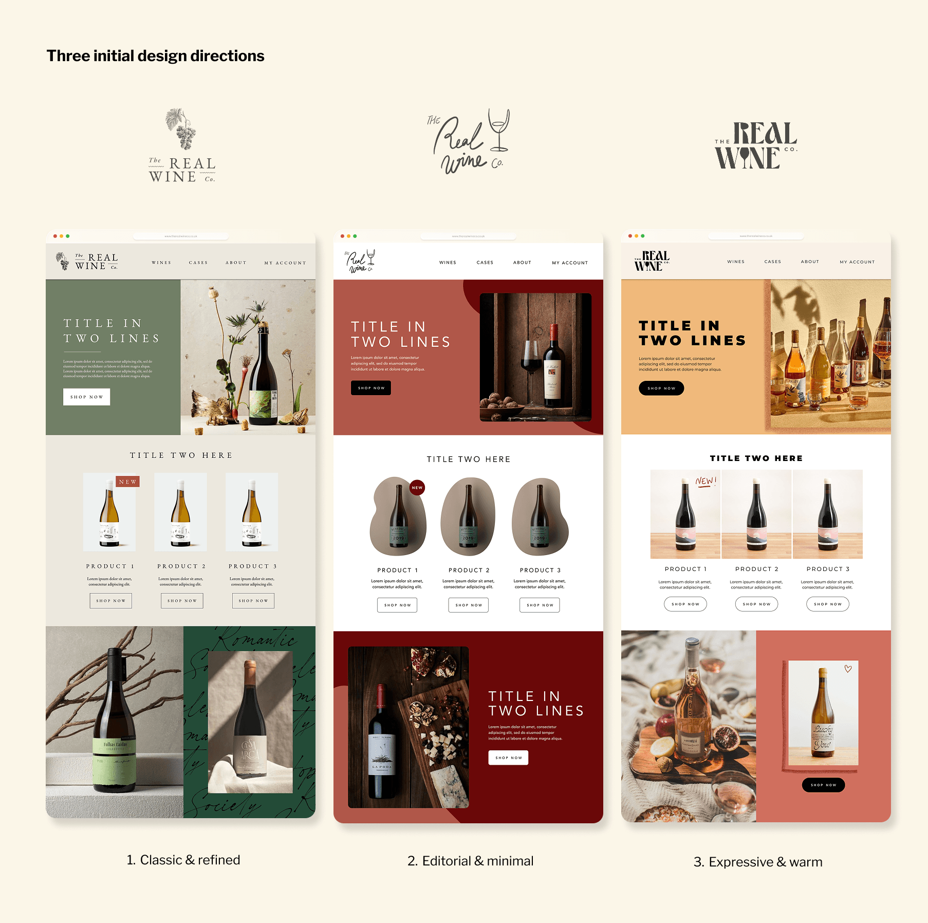
A deep dive into ten competitors mapped the visual codes of the category — colour, typography, logo approaches and imagery. The goal was two-fold: bring the brand up to industry standard after years of inconsistency, and identify where there was room to do something more distinctive.
Three creative directions were developed, each translating the brand values into a distinct visual world. The starting point for each was feeling — how the customer actually experiences wine — rather than aesthetics alone.
Artisanal Essence
The surprising pleasure of discovering new wines and producers you wouldn't have found otherwise.
Modern Elegance
The feeling of experiencing premium quality at a great price, in the intimate setting of a wine cellar.
Family Vineyard
The warmth of sharing a bottle with the people you love.
.jpg)